Examining “squishiness” in Intrinsic Web Design - LogRocket Blog
[
Advisory boards aren’t only for executives. Join the LogRocket Content Advisory Board today →
](https://lp.logrocket.com/blg/content-advisory-board-signup).metrics-banner {padding: 8px 0px; background: #764abc ;color: #ffffff;} .metrics-banner h6 {color: #ffffff;text-align:center; margin: 0px !important;} #metrics-embed {width: 65.5%; margin: 0px auto; display: block;} .mediumnavigation {padding: 0px 0px 8px 0px;} @media all and (max-width: 800px){ .mediumnavigation{box-shadow: none !important;} #metrics-embed {width: 90%;} .mainheading {padding: 4rem 0 1rem 0;} }

2019-01-08
1531
#css#web design
HJ Chen
247
Jan 8, 2019 ⋅ 5 min read
Examining “squishiness” in Intrinsic Web Design

HJ Chen 🇲🇾🏀🖌👟💻🎙🦊✒️👾🚲🏳️🌈🥑 Developer Advocate @NexmoDev

Introducing Galileo AI
LogRocket’s Galileo AI watches every session, surfacing impactful user struggle and key behavior patterns.
const threshold = 2000; const isMobile = window.matchMedia("(max-width: 1280px)").matches; window.addEventListener('scroll', (event) => { if (isMobile) { return; } const gutter = document.querySelector(".plug-gutter"); // show it if it is hidden and we have scrolled past the threshold if (window.scrollY > threshold && !gutter.classList.contains("show")) { gutter.classList.add("show"); window.toggleToc(true); } // hide it if we scroll back above the threshold if (window.scrollY < threshold && gutter.classList.contains("show")) { gutter.classList.remove("show"); window.toggleToc(false); } });
.plug-dev-top--card { border: 2px solid rgba(118, 74, 188, 0.2); border-radius: 8px; background-color: #491d90; justify-content: space-between; align-items: center; padding: 16px; font-family: 'Proxima Nova', sans-serif; display:flex; gap: 1rem; cursor: pointer; } .plug-dev-top--logo { width: 48px; height: 48px; border-radius: 50%; } .plug-dev-top--blurb { h2 { font-weight: 800; font-size: 22px; line-height: 22px; color: #fff; width: 70%; margin: 0 0 5px 0; } h3 { font-weight: 900; font-size: 13px; line-height: 13px; letter-spacing: 0.1em; color: #fff; opacity: 0.5; white-space: nowrap; margin: 0; } } .plug-dev-top--cta { background-color: #fff; color: #764abc; border: none; border-radius: 4px; padding: 10px; font-size: 16px; font-weight: 800; font-family: 'Proxima Nova', sans-serif; text-decoration: none; width: 25%; text-align: center; &:hover { text-decoration: none; color: #a58ec8; } } .plug-dev-top--asset { position: relative; height: 400px; overflow: hidden; transition: all 0.3s ease; margin-top: 30px; &.lr-hidden { height: 0; margin: 0; } }

See how LogRocket's Galileo AI surfaces the most severe issues for you
No signup required
Check it out
const wistiaIframe = document.querySelector("#galileo-wistia-iframe"); wistiaIframe.addEventListener('load', () => { const player = wistiaIframe.wistiaApi; window.document.querySelector(".plug-dev-top").addEventListener('click', () => { const videoContainer = window.document.querySelector(".plug-dev-top--asset"); videoContainer.classList.toggle('lr-hidden'); if (videoContainer.classList.contains("lr-hidden")) { player.pause(); } else { player.play(); } }); });

One of the highlights in the world of web design for 2018 was when Jen Simmons came up with the term Intrinsic Web Design and shared it with the world. Intrinsic Web Design is not a framework. It isn’t a set of rules to follow either. Rather, it is a collection of concepts that highlight what is now possible with modern CSS. How we choose to utilize these concepts for better art direction on the web and to build better layouts, that’s up to us.
Jen covered the following six major concepts when she talked about Intrinsic Web Design:
- combining both fluid and fixed
- stages of squishiness
- truly two-dimensional layouts
- nested contexts
- expanding and contracting content
- media queries, as needed
You’ll notice that none of those concepts pinpoint a specific CSS property or module. That is because CSS works best when various complementary properties are used together. In this post, I want to talk about the concept of stages of squishiness, and how it is going to greatly enhance art direction of editorial content on the web.

Sizing items with CSS
Let’s start off with some basics. Browsers perform a lot of computations to ensure that every element gets rendered correctly on a web page. Each element has to have every possible CSS property value resolved and computed before it can be laid out on the page.
According to the visual formatting model, each element in the document tree generates zero or more boxes. And there are numerous factors that influence the dimensions of these boxes.
The CSS specification that covers this in detail is the CSS Intrinsic & Extrinsic Sizing Module Level 3. Extrinsic sizing is based on the context of the element, without taking into account its contents, while intrinsic sizing is based on the contents of the element, without taking into account its context.
Most of us would be familiar with extrinsic sizing because that’s usually what we use to size items in our web pages. Almost every web developer I’ve met started off by doing things like setting width and height with fixed CSS units like px, or relative CSS units like percentages.
Then we’d learn about rem and em units, and gravitate towards those. Some of us start using viewport units as well, which were another type of relative unit. Sizing in this manner ignores the content in the element altogether, as illustrated in the following Codepens:
See the Pen
CSS sizing: Extrinsic relative units by Chen Hui Jing (@huijing)
on CodePen.
It’s not that intrinsic sizing is a new thing, I think it’s more that the usage of intrinsic sizing simply meant leaving things alone. The browser is doing the sizing for us based on the amount of content within the element.
There is a long rule set to determining an element’s width and height, depending on its type (block or inline, replaced or not, positioning scheme etc.), which can be found from the CSS2.1 specification if you’re interested. And the CSS Intrinsic & Extrinsic Sizing Module Level 3 extends the specification further.
One thing I want to remind everyone when it comes to the width and height properties is that these two sizing properties do not apply to inline elements. The width of an inline element is determined by the width its rendered content, while the height of an inline element is determined by font size.
The Level 3 specification adds new content-based keywords to the width and height properties, namely: min-content, max-content and fit-content(), which allows non-inline elements to have more content-based sizing options.
All of these values are supported when used in a Grid formatting context. However, your mileage may vary if you want to use them in sizing properties at the moment.
See the Pen
CSS sizing: content-based sizing by Chen Hui Jing (@huijing)
on CodePen.
Relative sizing of elements
A common design pattern for responsive design on the web is having columns of content adjust to fit the viewport. Developers would code such layouts with numerous media queries, as the width of each column had to be specified at specific breakpoints. This approach would be achieved with either floats or inline-block, but the mechanism of using numerous media queries is the same.
See the Pen
CSS sizing: percentage columns by Chen Hui Jing (@huijing)
on CodePen.
As you resize the window and observe the columns growing and shrinking, notice that all of the columns grow and shrink at the same rate. This is to be expected because each column is sized as a percentage of the viewport width.
A consequence of this behaviour is that it becomes harder to build layouts that present different types of content at an optimum size across a broad spectrum of viewport sizes. Content with intrinsic aspect ratios, like images, would require more consideration as opposed to textual content, which can flow and adapt more easily.
Sizing with variable rates of change
Let’s take a look at situations where the size of columns grow and shrink at different rates. Such situations may arise when we are operating in a flex formatting context, a grid formatting context when certain track-sizes are applied, or when content-based sizing is used.
[

](https://lp.logrocket.com/blg/learn-more)
[#replay-signup { margin-block: 1rem; display: flex; gap: 0.5rem; flex-direction: column; align-items: center; border: 1px solid #E6DFF6; border-radius: 16px; padding: 0.5rem 2rem; background-color: #F4F0FB; font-family: 'Proxima Nova', sans-serif; font-size: 0.95rem; h3 { margin: 0; font-weight: bold; } p { max-inline-size: 65ch; } .replay-signup-form-wrapper { width: 60%; } .nf-before-form-content { display: none; } input.nf-element[type="submit"] { background-color: #764abc; color: #fff; border-radius: 8px; padding-block: 10px; height: unset; width: 100%; display: block; } .nf-response-msg { font-size: 1.2rem; text-align: center; } }
🚀 Sign up for The Replay newsletter
](https://lp.logrocket.com/blg/learn-more)
The Replay is a weekly newsletter for dev and engineering leaders.
Delivered once a week, it's your curated guide to the most important conversations around frontend dev, emerging AI tools, and the state of modern software.
Notice: JavaScript is required for this content.
var formDisplay=1;var nfForms=nfForms||[];var form=[];form.id='48';form.settings={"objectType":"Form Setting","editActive":true,"title":"Replay Newsletter Signup","show_title":0,"allow_public_link":0,"embed_form":"","clear_complete":1,"hide_complete":1,"default_label_pos":"above","wrapper_class":"","element_class":"","form_title_heading_level":"3","key":"","add_submit":0,"changeEmailErrorMsg":"Please enter a valid email address!","changeDateErrorMsg":"Please enter a valid date!","confirmFieldErrorMsg":"These fields must match!","fieldNumberNumMinError":"Number Min Error","fieldNumberNumMaxError":"Number Max Error","fieldNumberIncrementBy":"Please increment by ","formErrorsCorrectErrors":"Please correct errors before submitting this form.","validateRequiredField":"This is a required field.","honeypotHoneypotError":"Honeypot Error","fieldsMarkedRequired":"Fields marked with an *<\/span> are required","currency":"","unique_field_error":"A form with this value has already been submitted.","logged_in":false,"not_logged_in_msg":"","sub_limit_msg":"The form has reached its submission limit.","calculations":[],"conditions":[],"mp_breadcrumb":1,"mp_progress_bar":1,"mp_display_titles":0,"formContentData":[{"formContentData":["email","submit_1760469924554"],"order":0,"type":"part","clean":true,"title":"Part Title","key":"hzyqqobd"}],"objectDomain":"display","drawerDisabled":false,"ninjaForms":"Ninja Forms","fieldTextareaRTEInsertLink":"Insert Link","fieldTextareaRTEInsertMedia":"Insert Media","fieldTextareaRTESelectAFile":"Select a file","formHoneypot":"If you are a human seeing this field, please leave it empty.","fileUploadOldCodeFileUploadInProgress":"File Upload in Progress.","fileUploadOldCodeFileUpload":"FILE UPLOAD","currencySymbol":"$","thousands_sep":",","decimal_point":".","siteLocale":"en_US","dateFormat":"m\/d\/Y","startOfWeek":"1","of":"of","previousMonth":"Previous Month","nextMonth":"Next Month","months":["January","February","March","April","May","June","July","August","September","October","November","December"],"monthsShort":["Jan","Feb","Mar","Apr","May","Jun","Jul","Aug","Sep","Oct","Nov","Dec"],"weekdays":["Sunday","Monday","Tuesday","Wednesday","Thursday","Friday","Saturday"],"weekdaysShort":["Sun","Mon","Tue","Wed","Thu","Fri","Sat"],"weekdaysMin":["Su","Mo","Tu","We","Th","Fr","Sa"],"recaptchaConsentMissing":"reCaptcha validation couldn't load.","recaptchaMissingCookie":"reCaptcha v3 validation couldn't load the cookie needed to submit the form.","recaptchaConsentEvent":"Accept reCaptcha cookies before sending the form.","currency_symbol":"","beforeForm":"","beforeFields":"","afterFields":"","afterForm":""};form.fields=[{"objectType":"Field","objectDomain":"fields","editActive":false,"order":999,"idAttribute":"id","type":"email","label":"Email","key":"email","label_pos":"hidden","required":1,"default":"","placeholder":"Email","container_class":"","element_class":"","admin_label":"","help_text":"","custom_name_attribute":"email","personally_identifiable":1,"value":"","manual_key":true,"drawerDisabled":false,"id":401,"beforeField":"","afterField":"","parentType":"email","element_templates":["email","input"],"old_classname":"","wrap_template":"wrap"},{"objectType":"Field","objectDomain":"fields","editActive":false,"order":999,"idAttribute":"id","type":"submit","label":"Submit","processing_label":"Submitting...","container_class":"","element_class":"","key":"submit_1760469924554","admin_label":"","drawerDisabled":false,"id":402,"beforeField":"","afterField":"","value":"","label_pos":"above","parentType":"textbox","element_templates":["submit","button","input"],"old_classname":"","wrap_template":"wrap-no-label"}];nfForms.push(form); {{{ data.renderProgressBar() }}} {{{ data.renderBreadcrumbs() }}} {{{ data.renderPartTitle() }}} {{{ data.title }}}
{{{ data.renderNextPrevious() }}} <# if ( data.showPrevious ) { #>
<# _.each( data.parts, function( part, index ) { #>
function registerNinjaFormsCallback() { if (!(window.nfRadio && window.lr_analytics)) { return; } window.nfRadio.channel("forms").on("submit:response", function(submission) { console.log(submission); if (submission.data.form_id !== "48") { return; } window.lr_analytics.track("blog-replay-newsletter-signup", { post: window.location.pathname, email: submission.data.fields_by_key?.email?.value, }); }); } registerNinjaFormsCallback();
Over 200k developers use LogRocket to create better digital experiences
 Learn more →
@media all and (max-width: 800px){ .tweet-embed-container {flex-direction: column !important;} .single-tweet, .embed-tweet-right {width: 100% !important;} } .embed-link {text-decoration: none;} .embed-link:hover {text-decoration: none;} .tweet-embed-container {border-radius: 20px; background: radial-gradient(79.69% 102.24% at 100% 100.11%, rgba(0, 0, 0, 0.2), rgba(0, 0, 0, 0)), radial-gradient(89.7% 115.09% at 3.43% 2.75%, rgba(255, 255, 255, 0.7), rgba(255, 255, 255, 0)), #764ABC; background-blend-mode: overlay, overlay, normal; box-shadow: 0 4px 0 #d5d5d5; width: auto; padding: 20px 15px; display: flex; flex-direction: row; justify-content: space-evenly; align-items: center; margin: 0 auto; gap: 3%; } .single-tweet {width: 50%;} .single-tweet img {max-width: 100%;height: auto; border-radius:7px;} .embed-tweet-right {width: 46%;} .embed-tweet-right h2 {font-family: 'Avenir'; font-style: normal; font-weight: 500; font-size: 16px; line-height: 28px; color: #FFFFFF;} .embed-btn { display: flex; flex-direction: row; justify-content: left; width: 170px; gap: 5px; align-items: center; padding: 0px 10px; font-family: 'Avenir'; font-style: normal; font-weight: 900; font-size: 16px; line-height: 16px; color: #764ABC; height: 48px; /* White */ background: #FFFFFF; mix-blend-mode: normal; box-shadow: 0px 24px 30px rgba(0, 0, 0, 0.11); border-radius: 80px; border: none; }
For this Flexbox example, I highly recommend reading Rachel Andrew’s step-by-step explanation of how the sizing algorithm works. Here you can see when there is more content in the last column Flexbox gives it more space and shrinks the second column “earlier” for the bottom example versus the top one.
See the Pen
CSS sizing: rate of change with Flexbox by Chen Hui Jing (@huijing)
on CodePen.
Grid introduces the fr unit, which is defined as the fraction of the leftover space in the grid container. It behaves similarly to how flex items fill up space within a flex container.
Once all non-flexible tracks have reached their maximum size, the total size of such rows or columns is subtracted from the available space, yielding the leftover space, which is then divided among the flex-sized rows and columns in proportion to their flex factor.
For this Grid-based example, columns are sized with a variety of values, and this affects their resultant behaviour when the viewport size changes. For the first example, the first column is sized with 1fr, which means it takes up the amount of space required for the content plus any available free space. So it will keep growing if the viewport gets wider.
As the viewport shrinks, however, its behaviour is determined by how the other columns are sized. The other two columns are auto and fit-content(400px), which, as space is taken away, behave similarly because fit-content resolves to minmax(auto, max-content), except that it’s clamped at the provided argument value.
https://codepen.io/huijing/pen/VqeGba/
For the second example, the last column is sized with minmax(200px, 400px). Notice that this column holds its maximum size for as long as possible, while other columns shrink. The fr column shrinks first, followed by the auto column. But both the auto column and minmax() column reach their minimum size at the same time.
#podrocket-plug { border-radius: 12px; width: 75%; height: 352px; margin: 1rem auto; display: block; }
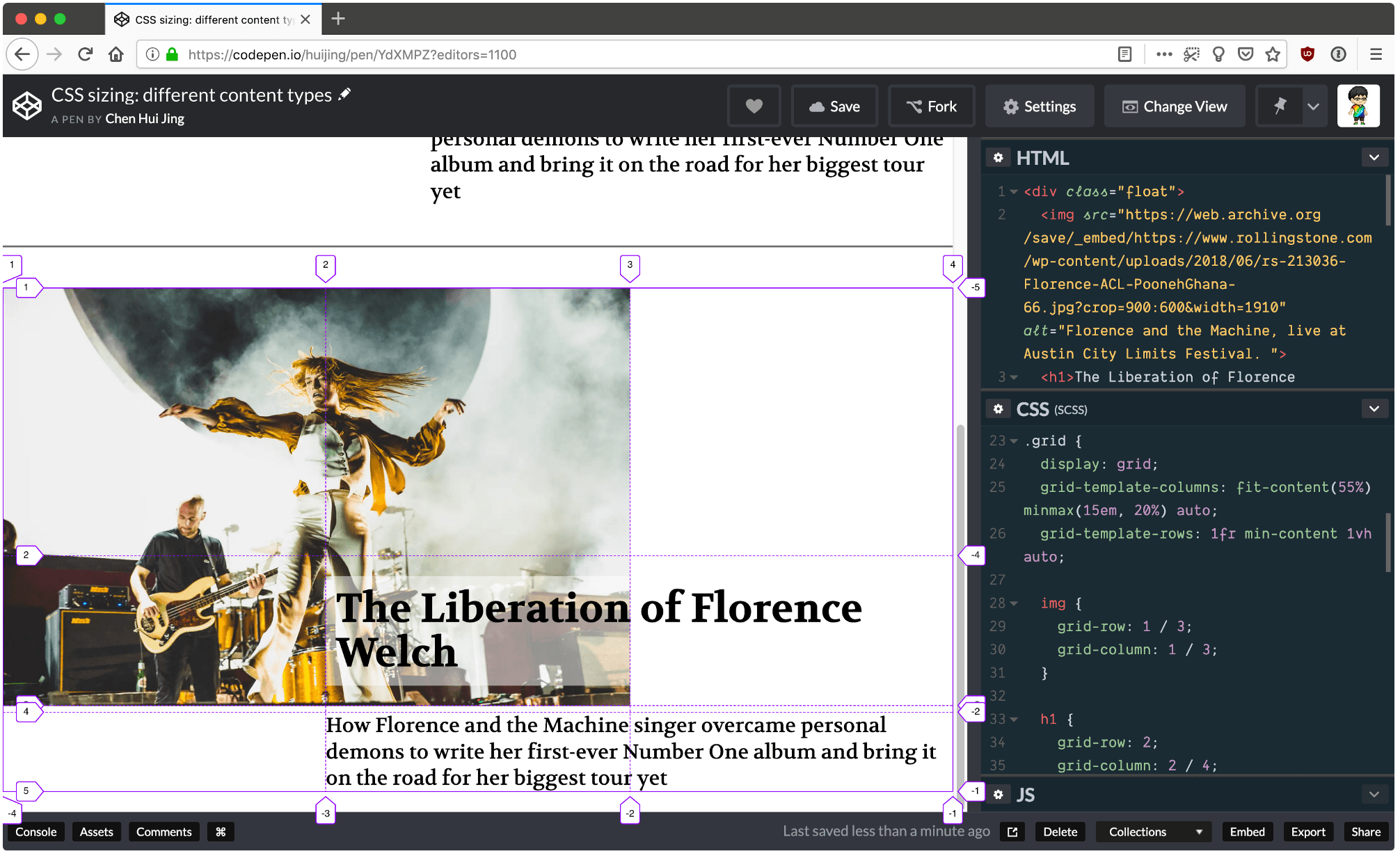
Better responsive art-direction
Now let’s apply this to an actual design. This example could be for a featured article on an editorial publication, with a large hero image, header and some opening text. Again, I highly recommend opening this demo in a separate window so behaviour across the full width of the viewport can be observed.
The first example is done with percentage sizing, and the limitation here is two-fold. Overlap of the header over the image is a little clunky because it’s done with negative margins. Secondly, the image and text all shrink at the same rate so at the narrowest size, the image is a bit too small and the text is also a bit too squished.
See the Pen
CSS sizing: different content types by Chen Hui Jing (@huijing)
on CodePen.
With Grid, the overlap is much easier to manage, as placing items within the grid is a matter of assigning them to the required rows and columns, and there is no limit against having multiple items taking up the same space on the grid.
More great articles from LogRocket:
- Don't miss a moment with The Replay, a curated newsletter from LogRocket
- Learn how LogRocket's Galileo AI watches sessions for you and proactively surfaces the highest-impact things you should work on
- Use React's useEffect to optimize your application's performance
- Switch between multiple versions of Node
- Discover how to use the React children prop with TypeScript
- Explore creating a custom mouse cursor with CSS
- Advisory boards aren’t just for executives. Join LogRocket’s Content Advisory Board. You’ll help inform the type of content we create and get access to exclusive meetups, social accreditation, and swag
If you have Firefox installed, open up DevTools and toggle on the Grid inspector, which will show you how the tracks are adjusting as the viewport size changes. In addition, use of minmax() for track sizing allows the content in the middle column to “hold“ its size as long as possible, while the tracks sized to auto shrink first.

Firefox has the best Grid inspector tool
Conclusion
Such behaviour gives web designers and developers better options and greater flexibility in terms of art direction and ensures that the focus of the content is never lost regardless of the context in which it is viewed in.
I highly encourage developers to try out these newer properties and techniques themselves, as it was through experimentation that I figured a lot of this stuff out. With more developers and designers using these new tools, we’ll have a greater pool of ideas and inspiration for building designs that truly suit the nature of the web.
Is your frontend hogging your users' CPU?
As web frontends get increasingly complex, resource-greedy features demand more and more from the browser. If you’re interested in monitoring and tracking client-side CPU usage, memory usage, and more for all of your users in production, try LogRocket.

LogRocket lets you replay user sessions, eliminating guesswork around why bugs happen by showing exactly what users experienced. It captures console logs, errors, network requests, and pixel-perfect DOM recordings — compatible with all frameworks.
LogRocket's Galileo AI watches sessions for you, instantly identifying and explaining user struggles with automated monitoring of your entire product experience.
Modernize how you debug web and mobile apps — start monitoring for free.
.share-icon.share-twitter span:first-child { background-image: url("https://blog.logrocket.com/wp-content/themes/logrocket/assets/svgs/share-twitter.svg"); } .share-icon.share-reddit span:first-child { background-image: url("https://blog.logrocket.com/wp-content/themes/logrocket/assets/svgs/share-reddit.svg"); } .share-icon.share-linkedin span:first-child { background-image: url("https://blog.logrocket.com/wp-content/themes/logrocket/assets/svgs/share-linkedin.svg"); } .share-icon.share-facebook span:first-child { background-image: url("https://blog.logrocket.com/wp-content/themes/logrocket/assets/svgs/share-facebook.svg"); }


Stop guessing about your digital experience with LogRocket
[
Get started for free
](https://lp.logrocket.com/blg/signup)
@media all and (max-width: 750px) { .footer-cta-logo-container {display:none !important;} .footer-cta-container h2 {width: 90% !important; padding-top: 50px !important;} .footer-cta-button {width: 40% !important;} } .footer-cta-container {border-radius: 20px;background: linear-gradient(90.32deg, #8F00FF 0.28%, rgba(143, 0, 255, 0) 99.72%), #764ABC; box-shadow: 0px 64px 74px 0px #764ABC40; padding-bottom: 30px; width: 95%; margin: 0 auto 60px auto; position: relative; margin-top: 3rem; } .footer-cta-tr {position: absolute; top: 30px; right: 30px; } .footer-cta-bl {position: absolute; bottom: 30px; left: 30px; } .footer-cta-bl {} .footer-cta-logo-container { width: 20%; padding: 10px 15px; display:block; margin: 0 auto; position: relative; background: #fafafa; border-radius: 0 0 20px 20px; } .footer-cta-logo-container::before { content: ""; position: absolute; top: 0px; height: 50px; left: -25px; width: 25px; border-top-right-radius: 25px; box-shadow: 0 -25px 0 0 #fafafa; } .footer-cta-logo-container::after { content: ""; position: absolute; top: 0px; height: 50px; right: -25px; width: 25px; border-top-left-radius: 25px; box-shadow: 0 -25px 0 0 #fafafa; } .footer-cta-container h2 {color: #ffffff; text-align: center; width: 70%; position: relative; margin: 40px auto;} .footer-cta-container a {text-decoration: none;} .footer-cta-logo-container img {display: block; margin: 0 auto; padding: 10px; max-width: 150px;} .footer-cta-br {position: absolute; left: 5px; bottom: 5px;} .footer-cta-button {padding: 10px 20px; border: 1px solid #ffffff; width: 20%; border-radius: 20px; color: #ffffff; position: relative; display:block; margin: 0 auto 20px auto; text-align: center; text-decoration: none;}
Recent posts:
[

Should you bet on Valdi instead of React Native?
](https://blog.logrocket.com/valdi-instead-react-native/)
Valdi skips the JavaScript runtime by compiling TypeScript to native views. Learn how it compares to React Native’s new architecture and when the trade-off makes sense.

Dec 30, 2025 ⋅ 7 min read
[

The 8 trends that will define web development in 2026
](https://blog.logrocket.com/8-trends-web-dev-2026/)
What trends will define web development in 2026? Check out the eight most important trends of the year, from AI-first development to TypeScript’s takeover.

Dec 30, 2025 ⋅ 6 min read
[

AI-first debugging: Tools and techniques for faster root cause analysis
](https://blog.logrocket.com/ai-debugging/)
AI-first debugging augments traditional debugging with log clustering, pattern recognition, and faster root cause analysis. Learn where AI helps, where it fails, and how to use it safely in production.

Dec 29, 2025 ⋅ 6 min read
[

Container queries in 2026: Powerful, but not a silver bullet
](https://blog.logrocket.com/container-queries-2026/)
Container queries let components respond to their own layout context instead of the viewport. This article explores how they work and where they fit alongside media queries.

Dec 26, 2025 ⋅ 12 min read
#comments .comment .reply::after { background-image: url("https://blog.logrocket.com/wp-content/themes/logrocket/assets/svgs/reply.svg"); background-repeat: no-repeat; }
Leave a ReplyCancel reply
document.addEventListener('DOMContentLoaded', function () { var commentForms = document.getElementsByClassName('jetpack_remote_comment'); for (var i = 0; i < commentForms.length; i++) { commentForms[i].allowTransparency = false; commentForms[i].scrolling = 'no'; } });
{"prefetch":[{"source":"document","where":{"and":[{"href_matches":"/*"},{"not":{"href_matches":["/wp-*.php","/wp-admin/*","/wp-content/uploads/*","/wp-content/*","/wp-content/plugins/*","/wp-content/themes/logrocket/*","/*\\?(.+)"]}},{"not":{"selector_matches":"a[rel~=\"nofollow\"]"}},{"not":{"selector_matches":".no-prefetch, .no-prefetch a"}}]},"eagerness":"conservative"}]}
Hey there, want to help make our blog better?
Yea No Thanks
Join LogRocket’s Content Advisory Board. You’ll help inform the type of content we create and get access to exclusive meetups, social accreditation, and swag.
var codePrettifyLoaderBaseUrl = "https:\/\/blog.logrocket.com\/wp-content\/plugins\/code-prettify\/prettify"; //# sourceURL=code-prettify-js-before var WPGroHo = {"my_hash":""}; //# sourceURL=wpgroho-js-extra _stq = window._stq || []; _stq.push([ "view", JSON.parse("{\"v\":\"ext\",\"blog\":\"217016018\",\"post\":\"247\",\"tz\":\"-5\",\"srv\":\"blog.logrocket.com\",\"hp\":\"vip\",\"j\":\"1:15.1.1\"}") ]); _stq.push([ "clickTrackerInit", "217016018", "247" ]); //# sourceURL=jetpack-stats-js-before {"baseUrl":"https://s.w.org/images/core/emoji/17.0.2/72x72/","ext":".png","svgUrl":"https://s.w.org/images/core/emoji/17.0.2/svg/","svgExt":".svg","source":{"concatemoji":"https://blog.logrocket.com/wp-includes/js/wp-emoji-release.min.js?ver=6.9"}} /*! This file is auto-generated */ const a=JSON.parse(document.getElementById("wp-emoji-settings").textContent),o=(window._wpemojiSettings=a,"wpEmojiSettingsSupports"),s=["flag","emoji"];function i(e){try{var t={supportTests:e,timestamp:(new Date).valueOf()};sessionStorage.setItem(o,JSON.stringify(t))}catch(e){}}function c(e,t,n){e.clearRect(0,0,e.canvas.width,e.canvas.height),e.fillText(t,0,0);t=new Uint32Array(e.getImageData(0,0,e.canvas.width,e.canvas.height).data);e.clearRect(0,0,e.canvas.width,e.canvas.height),e.fillText(n,0,0);const a=new Uint32Array(e.getImageData(0,0,e.canvas.width,e.canvas.height).data);return t.every((e,t)=>e===a[t])}function p(e,t){e.clearRect(0,0,e.canvas.width,e.canvas.height),e.fillText(t,0,0);var n=e.getImageData(16,16,1,1);for(let e=0;e{s[e]=t(o,e,n,a)}),s}function r(e){var t=document.createElement("script");t.src=e,t.defer=!0,document.head.appendChild(t)}a.supports={everything:!0,everythingExceptFlag:!0},new Promise(t=>{let n=function(){try{var e=JSON.parse(sessionStorage.getItem(o));if("object"==typeof e&&"number"==typeof e.timestamp&&(new Date).valueOf(){i(n=e.data),r.terminate(),t(n)})}catch(e){}i(n=f(s,u,c,p))}t(n)}).then(e=>{for(const n in e)a.supports[n]=e[n],a.supports.everything=a.supports.everything&&a.supports[n],"flag"!==n&&(a.supports.everythingExceptFlag=a.supports.everythingExceptFlag&&a.supports[n]);var t;a.supports.everythingExceptFlag=a.supports.everythingExceptFlag&&!a.supports.flag,a.supports.everything||((t=a.source||{}).concatemoji?r(t.concatemoji):t.wpemoji&&t.twemoji&&(r(t.twemoji),r(t.wpemoji)))}); //# sourceURL=https://blog.logrocket.com/wp-includes/js/wp-emoji-loader.min.js (function () { const iframe = document.getElementById( 'jetpack_remote_comment' ); const watchReply = function() { // Check addComment._Jetpack_moveForm to make sure we don't monkey-patch twice. if ( 'undefined' !== typeof addComment && ! addComment._Jetpack_moveForm ) { // Cache the Core function. addComment._Jetpack_moveForm = addComment.moveForm; const commentParent = document.getElementById( 'comment_parent' ); const cancel = document.getElementById( 'cancel-comment-reply-link' ); function tellFrameNewParent ( commentParentValue ) { const url = new URL( iframe.src ); if ( commentParentValue ) { url.searchParams.set( 'replytocom', commentParentValue ) } else { url.searchParams.delete( 'replytocom' ); } if( iframe.src !== url.href ) { iframe.src = url.href; } }; cancel.addEventListener( 'click', function () { tellFrameNewParent( false ); } ); addComment.moveForm = function ( _, parentId ) { tellFrameNewParent( parentId ); return addComment._Jetpack_moveForm.apply( null, arguments ); }; } } document.addEventListener( 'DOMContentLoaded', watchReply ); // In WP 6.4+, the script is loaded asynchronously, so we need to wait for it to load before we monkey-patch the functions it introduces. document.querySelector('#comment-reply-js')?.addEventListener( 'load', watchReply ); const commentIframes = document.getElementsByClassName('jetpack_remote_comment'); window.addEventListener('message', function(event) { if (event.origin !== 'https://jetpack.wordpress.com') { return; } if (!event?.data?.iframeUniqueId && !event?.data?.height) { return; } const eventDataUniqueId = event.data.iframeUniqueId; // Change height for the matching comment iframe for (let i = 0; i < commentIframes.length; i++) { const iframe = commentIframes[i]; const url = new URL(iframe.src); const iframeUniqueIdParam = url.searchParams.get('iframe_unique_id'); if (iframeUniqueIdParam == event.data.iframeUniqueId) { iframe.style.height = event.data.height + 'px'; return; } } }); })(); {{{ ( 1 == data.settings.show_title ) ? '' + data.settings.title + '' : '' }}}